Capstone Project for the UC San Diego Interaction Design Certificate
In November 2016, I completed the Capstone Project for my Interaction Design Certificate. Inspired by a design brief focusing on the concept of time, I crafted a delightful new task management experience in just 10 weeks. As part of my process, I interviewed potential users to understand their needs, created paper prototypes, designed mockups, and tested the designs in person and online, making changes along the way.
I documented my process and design evolution on Medium and in the post below: https://medium.com/@jadeshyu/taskwiz-a-10-week-journey-through-interaction-design-753c40efb0c8
- Role: Solo UX Designer
- Timeline: 10 weeks
- Platform: iOS
- Tools: Sketch, Adobe Photoshop, Adobe Premiere
About the UC San Diego Interaction Design Certificate
The 8-course Interaction Design Certificate focuses on principles of design and human computer interaction, with modules on research, ideation, prototyping, feedback generation and synthesis, and iterative testing. Completed coursework includes:
- Human-Centered Design: An Introduction
- Design Principles: An Introduction
- Social Computing
- Input and Interaction
- User Experience: Research & Prototyping
- Information Design
- Designing, Running, and Analyzing Experiments
- Interaction Design Capstone Project
The specialization is offered by UC San Diego through Coursera.
Design Brief
The concept of TaskWiz started with a simple design brief:
Mission:
Redesign the way we experience or interact with time.
Inspired by the mission and the idea of a calendar that assigns tasks based on energy level, I set off to work.
Ideation
I started with a set of 3 interviews with professionals of various industries – a teacher, executive assistant, and project manager. I asked about their day-to-day activities and the ways they plan their time.
Next, I conceptualized ideas based on findings from the study. I summarized a list of user needs and connected them with a high-level concept that could help make users’ lives easier.
Two findings stood out:
- The executive assistant completes more tasks and activities when she is in a positive mood. She needs a place to prioritize and sort different categories of tasks, so that she can complete them when she is available and in good spirits.
- The teacher is an intrinsically motivated individual who rewards herself with stamps for accomplishing days of tasks in advance. She needs a way to gamify the process of planning and finishing tasks, so that she has fun and can celebrate her accomplishment with a symbol of completion.
I developed a point of view for the design brief:
The act of planning and completing tasks/activities is naturally a challenge, as a negative change in mood can hinder completion. What if planning and accomplishing tasks was as fun as playing a game? Creating an engaging, context-based atmosphere where users are rewarded for taking action can help them feel encouraged and accomplish more.
While brainstorming, I compared current task management tools in the market today. These tools ranged from analog to-do lists and annual planners, to digital task assistants and productivity games.
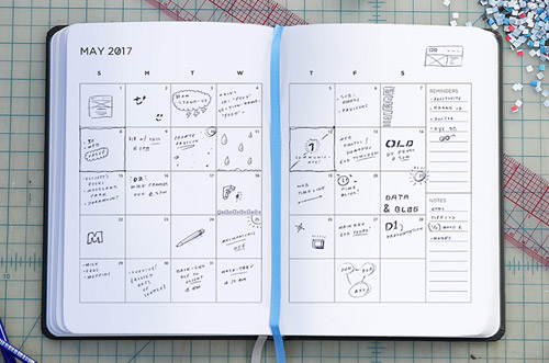

Many task management and to do list apps that I found emphasized function over delightful design, while a task gamification app lacked contextual features. Inspired by my findings, I thought about what this experience could look like.
Storyboarding
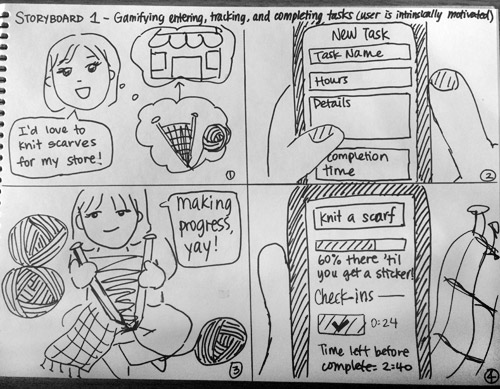
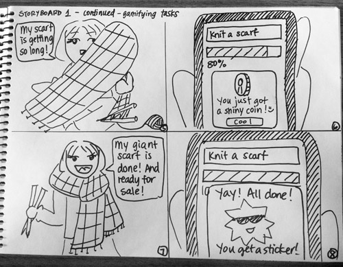
With the point of view in mind, I sketched two storyboards of the experience around a context-based task assistant with gamification qualities. I focused on users’ needs and how this tool could simplify their lives.
In the first storyboard, an entrepreneur gamifies the task of knitting scarves for her store.
In the second storyboard, a young professional picks up a book with the goal of finishing it soon.
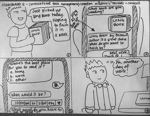
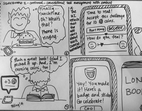
In these two scenarios, the task assistant helps users manage their progress, finds time in their busy schedule to complete the task, and upon completion of milestones, rewards users with in-app incentives.
Paper Prototyping
Using my storyboards as inspiration, I designed two paper prototypes from Post-its and paper cutouts, for a total of 36 “screens”.
Prototype 1 focused on manual input, while Prototype 2 focused on a chat-based experience. Here are snapshots of the prototypes:
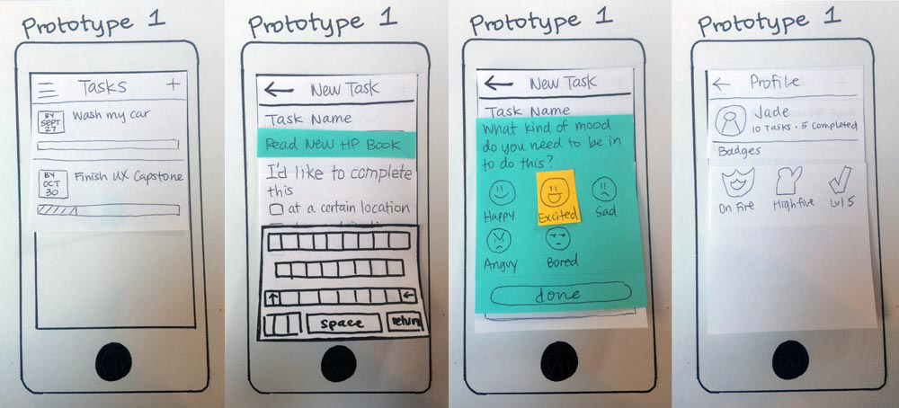
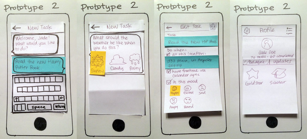
Both prototypes focused on the core idea of task management: one could enter tasks into fields the traditional way, or have a task assistant set up tasks for her. The prototypes featured contextual reminders for location, availability, mood, and weather, as well as gamification elements.
Next, I prepared the prototypes for user feedback.
Heuristic Feedback
After making minor revisions, I shared my paper prototypes online and in person for feedback, while evaluating my classmates’ prototypes. My classmates and I provided each other with feedback based on Jakob Nielsen’s Heuristics, with an emphasis on the heuristic violated and the severity of the violation.
Here are a few highlights from the hearty list of feedback:
- Limitations from contextual options (Recognition rather than recall). If a user set up the task so that he had to be “happy” to complete it, this could block the app from properly checking him in, if he forgot to choose the same emotion when the reminder popped up. Likewise, limiting a task to a certain type of weather could be a hindering factor. I decided to leave out emotion and weather to focus on other contextual elements.
- The check-in assumes task progress (Flexibility and efficiency of use). The user mentioned the check-in process asks for progress during the reminder, but that the user’s mindset is that he’s just getting started with the task. He suggested breaking down the check-in into two parts: the reminder and the follow-up.
- Task check-in was burdensome (Aesthetic and minimalist design). Users thought the check-in process was confusing and had too many steps: users navigated through dialog windows, added progress to their task, added a photo, and other progress detail. For simplicity, I decided to scale down the prototypes to one-time tasks.
- No way to track completed tasks (Recognition rather than recall). As the prototypes were in their infancy, marking tasks as complete had not been accounted for. A user suggested having a completed tasks screen.
Wireframing
From the heuristic feedback, I reflected on changes to be made, and decided to combine the two prototype ideas into one task assistant app.
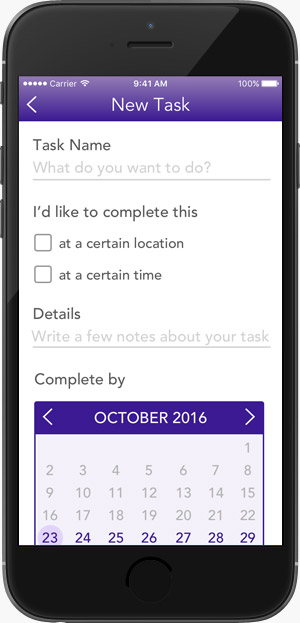
I drafted wireframes of key screens within my app:

High-Fidelity Mockups
Gradually, I conceptualized visual designs between user testing sessions.

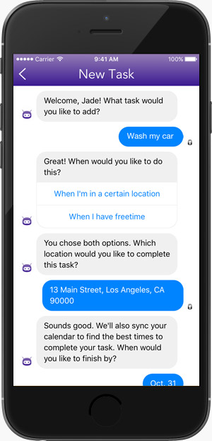

Testing
Between visual design iterations, I tested the app in person and online to examine areas of improvement and understand the pain points or delightful moments within the experience.
Part 1: In-Person Testing
To prepare for in-person testing, I designed additional screens, brainstormed an app name, wrote the testing protocol and documentation (consent forms, instructions, interview questions), and made tasks for testers. Testers were tasked with the following:
- Create two new tasks: one using the bot and one using manual input.
- Edit a task.
- Once a reminder comes up for a task, check-in to the task, and find out where users can view their coins.
I sought out three iPhone users who had used task management apps in the past and/or were current users. A couple of user feedback comments are shown below:
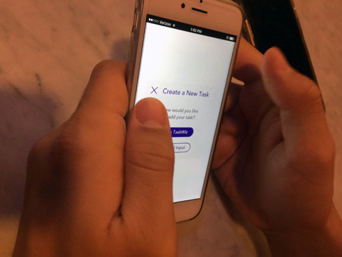
“What’s the difference between TaskWiz and manual input?”
This subject (as well as the others) were confused about what TaskWiz is, and how it helps a user plan tasks.
An introduction screen that outlines the benefits of TaskWiz would be helpful for first-time users.
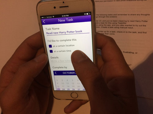
“Why isn’t it showing me the times?”
The participant tapped the checkbox for “at a certain time”, which led a system dialog to pop up. The pop-up asked for permission to access the phone calendar, so he skimmed quickly over it and accepted it. Then, he was surprised that no time selector appeared before the checkbox was selected.
Having a time selector, in addition to calendar sync, would be helpful in case a user wants flexibility in planning reminder times.
A sampling of my findings included:
- Difficulty understanding TaskWiz. When creating a new task, testers were given the choice to use “TaskWiz” or manual input, and all three testers asked, “What’s the difference between TaskWiz and manual input?”
- Confusion over coins. Testers are able to earn coins by checking in, and all were unsure about what coins were for and how they could be spent.
- Funny story. When I asked a user whether he would use the app again, he said yes, because he wanted to get some coins. I asked, “But what if you don’t know what they’re for?” He replied with a grin, “It doesn’t matter, I just want them!”
I brainstormed solutions for these issues with alternate designs for each.
Part 2: Online A/B Testing via UserTesting.com
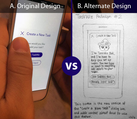
For my second test, I planned a Split A/B test between the original and alternate “Create a New Task” dialog design. My goal was to observe which design was more effective in conveying the goal of the app as a smart task assistant. I hypothesized that the new design would be easier to understand.
*Note: A high-fidelity version of Design B was tested. Scroll down for the big reveal!
After preparing prompts and interview questions on UserTesting.com, I divided my 4 testers into two groups, one that tested the original design (Group A), and one that tested the alternate design (Group B).
I was excited to go through the results, which, amazingly, were ready in about an hour. I delved through video recordings of testers talking through the tasks on their iPhones, and analyzed their written responses.
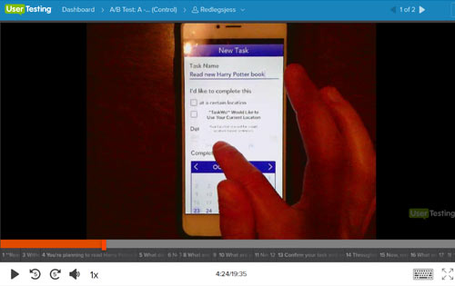
Test 1 – Original Design – A (Control)
The user repeatedly denied access for any of the pop-ups asking for permission, and said she generally does not like to give access to her location, photos, or anything that apps ask. This means that an alternate “default” would have to be created for location or schedule, so that this type of user is not blocked from using the rest of the app.

Test 2 – Original Design – A (Control)
The user stayed on this screen for several moments, deliberating on which option to use. “Use TaskWiz… I want to do the first one, but… manual input, what’s that mean?” His hesitation demonstrates that he was confused by both options.

Test 3 – Alternate Design – B
Upon seeing this screen, the user bursted, “Oh. This, uh… this is good. I liked that… a LOT. That is so beneficial.” The user mentioned this is what she needs. She wonders if this type of notification appears when she is using other apps and is supposed to be doing these tasks.

Test 4 – Alternate Design – B
The user saw the “Please give us permission to get your address on the next screen” message and thought it was confusing. She added that the message might relate to future preferences. In actuality, it should ask for the user’s current location.
After watching the testing videos and reading through the written responses, I uncovered more findings and a few surprises:
- The alternate design (B) was easier to understand. One tester reviewing the original design (A) said, “TaskWiz, I’m guessing, is some other piece of the software that does something for you… maybe it syncs something.” Conversely, both testers of the alternate design (B) delightedly exclaimed, “Ohh!” as they read through the dialog and chose the “wizard” option with no hesitation.
- Still confusing: coins. Both groups shared confusion about the coins. A user from Group A said, “the coins I would probably leave out if they serve no monetary value,” while a user from Group B said, “I am still unsure about what the coins are for!” To reduce confusion, I added more details in my final video walkthrough below.
- Delightful features: hidden surprises. Group B shared that they appreciated the personal touches that help the app to stand out among functional task apps. The features included gamification with coins and the bot sharing random funny videos.
- Potential killer feature: reminder follow-ups. Group B also appreciated having the reminder divided into two parts — the reminder and the follow-up. This feedback was originally suggested by my first paper prototype tester, and it was satisfying to see that this feature was well-received by others.
- Limitations: static prototype. The prototype was built from a set of static images on InVision, so it offered a glimpse into the intended interactions, but had to be completed in a certain order to demonstrate the full range of features. Having to go in order was a source of frustration for testers.
- Confounding variables: tech savviness and experience level in user testing. Both groups of testers included people in their early 20s and early 30s, but Group A expressed more hesitation/confusion and vocalized more frustration throughout the app. For example, one tester spent a few minutes analyzing the InVision app loading screen before realizing she was supposed to tap on the link shown.
- What I would do differently: clarify directions. I double-checked the testing prompts, but missed a few places that needed more clarity. In the future, in addition to performing comprehensive pilot tests, I could write out the name of the screen that a question references.
After synthesizing feedback and making final adjustments to my design, I used Adobe Premiere to create a walkthrough video that introduces the TaskWiz app.
Watch the TaskWiz Video Walkthrough
Completing the Interaction Design Specialization
With the completion of the Capstone Project, I achieved these milestones:
- In 10 weeks, I completed an intensive design process from beginning to end, learning about user needs, designing for these needs, and testing the designs with users, both online and offline.
- In 8 courses, I completed a certificate spanning the topics of human-centered design, design principles, social computing, research, prototyping, information design, and experiment design and analysis.
