In March 2017, I completed the Capstone Project for my Graphic Design Certificate. Inspired by innovations in biotech, I crafted a brand development guide for a fictitious tech startup within 7 weeks.
For this project, I researched historical and contemporary contexts, developed a logotype/mark, chose a color palette, and designed mockups for brand applications.
- Role: Solo Visual Designer
- Timeline: 7 weeks
- Tools: Adobe Photoshop, Adobe Illustrator, Adobe InDesign
About the CalArts Graphic Design Certificate
This 5-course Graphic Design specialization explores the fundamentals of visual communication through graphic design, typography, composition, visual contrast, and the history of design.
Completed courses include:
• Fundamentals of Graphic Design
• Introduction to Typography
• Introduction to Imagemaking
• Ideas from the History of Graphic Design
• Brand New Brand – Capstone Project
The specialization is offered by California Institute of the Arts through Coursera.
Inventing the Company
I envisioned a startup that manufactures microchips that allow people to control objects with their mind.
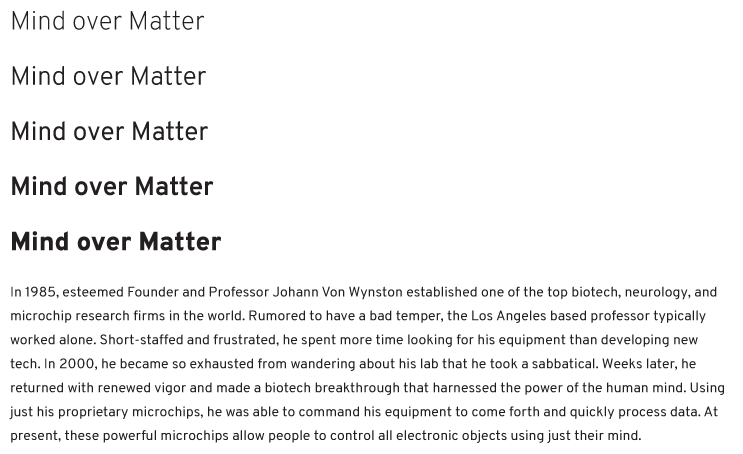
What would the story of this company look like? I pondered and composed the history of the founder:
In 1985, esteemed Founder and Professor Johann Von Wynston established one of the top biotech, neurology, and microchip research firms in the world. Rumored to have a bad temper, the Los Angeles based professor typically worked alone. Short-staffed and frustrated, he spent more time looking for his equipment than developing new tech. In 2000, he became so exhausted from wandering about his lab that he took a sabbatical. Weeks later, he returned with renewed vigor and made a biotech breakthrough that harnessed the power of the human mind. Using just his proprietary microchips, he was able to command his equipment to come forth and quickly process data. At present, these powerful microchips allow people to control objects using just their mind.
Brainstorming
I sketched a mindmap with ideas that would define the unnamed company’s philosophy and potential name.
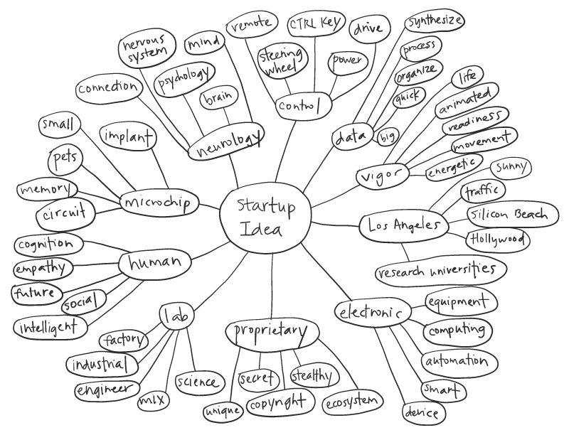
From these ideas, 3 philosophies emerged:
- kinetic
- intuitive
- versatile
From these 3 philosophies, I conceptualized three potential names and chose one:
- psynapse
- MINDCTRL
- IoM: Internet of Mind
Design Research
I researched contemporary references related to biotechnology, science, and futurism. I also noted vibrant color palettes that could be part of the product’s branding.
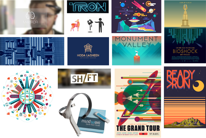
In addition, I searched for historical visual references on technology, telekinesis, medical products, as well as visual art from time periods in the past.

Logotype Development
I explored a variety of typefaces, forms, and styles. I eventually arrived at the final logotype style below.
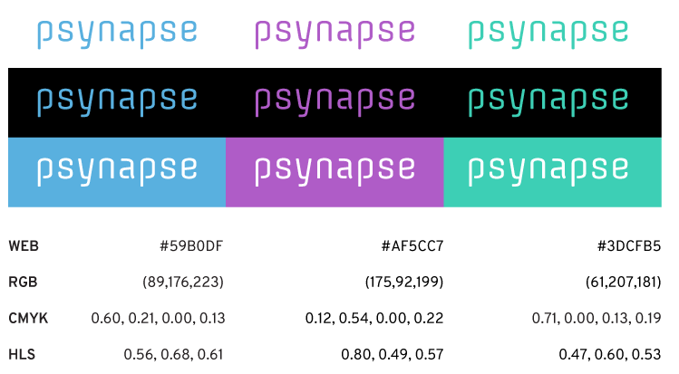
Color Palette
The chosen color palette evokes a sense of calm and autonomy from using one’s mind to achieve its greatest potential.
Logo Mark
The psynapse logo mark is an iconographic representation of the microchip product and the synaptic connections made between a person’s brain and an object.

Secondary Typeface
I discovered a modern font that would complement the playful, yet contemporary, characteristics of the main typeface.
Brand Applications
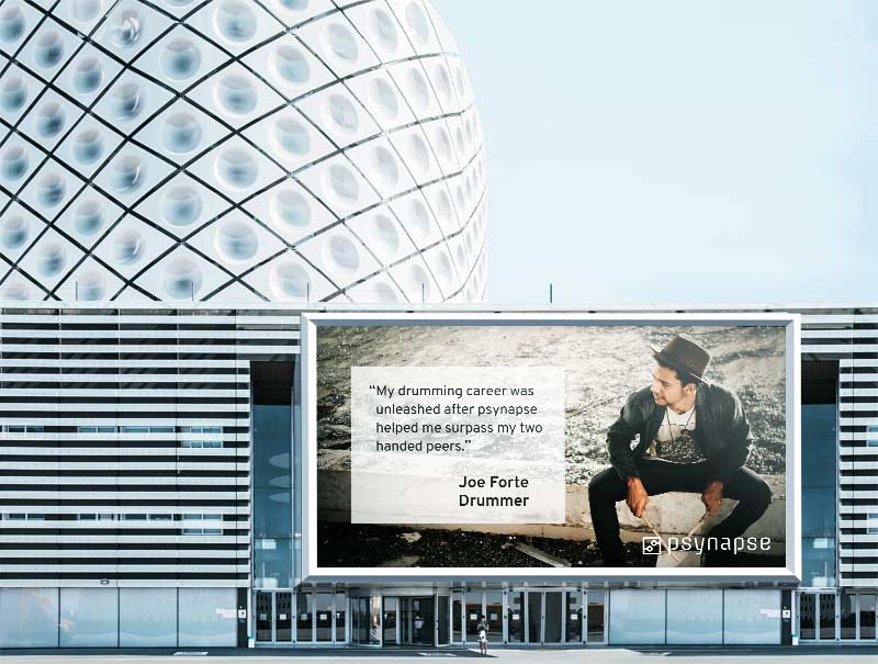
I applied the psynapse brand to several marketing and product packaging applications, starting with a billboard display.
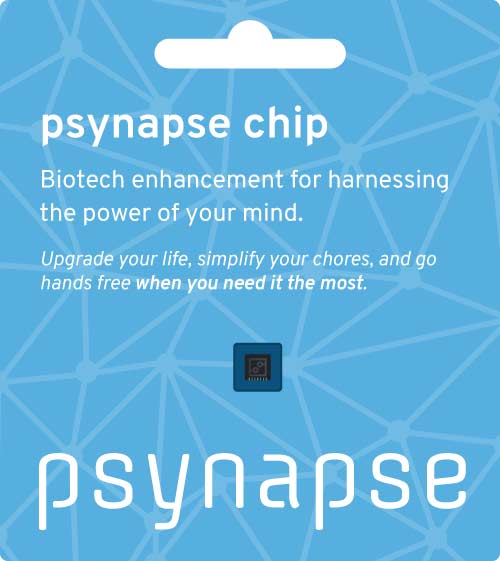
I crafted a package design focusing on the product, an implantable microchip. In the branding, the synapse motif is combined with a soothing color combination.
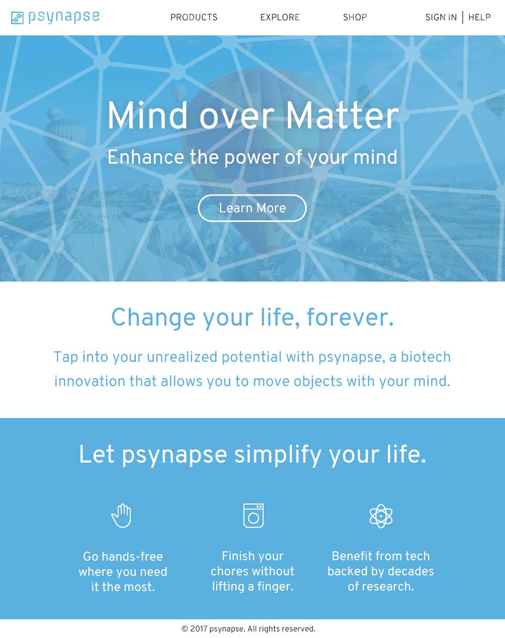
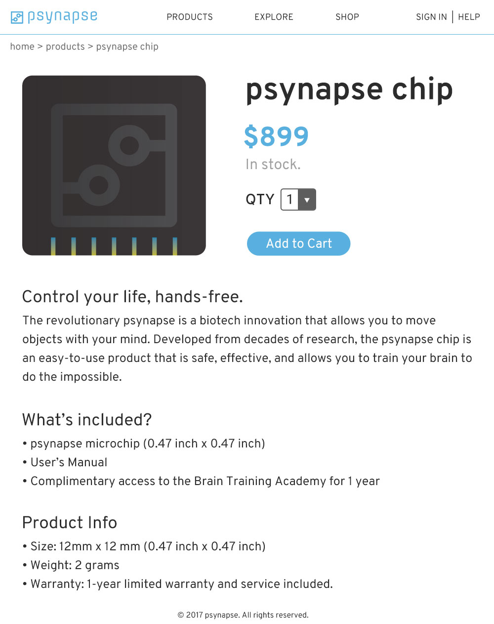
I designed a landing page for psynapse, which emphasizes the benefits of using the product and provides a call to action to learn more. In addition, I made a product page where a customer could view details about the microchip and add it to their shopping cart.
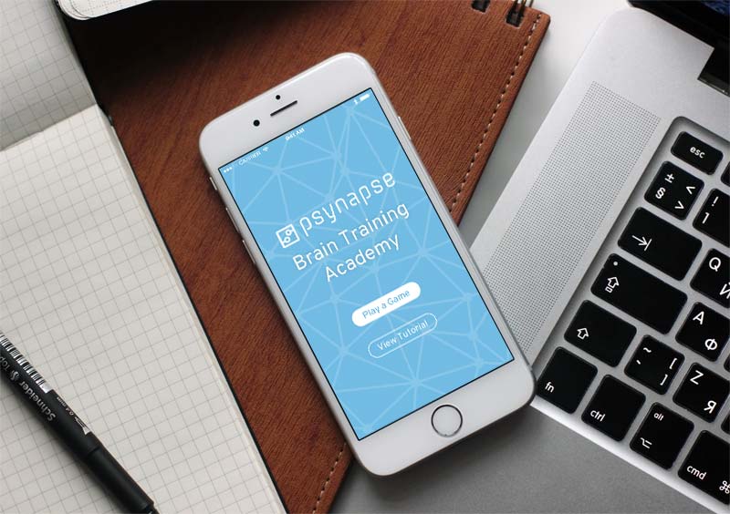
Finally, I created a Brain Training Academy mobile app mockup for iPhone. Users can play games or watch a tutorial.
Completing the Graphic Design Specialization
With the completion of the Capstone Project, I achieved these milestones:
- In 7 weeks, I explored the creation of a brand, from delving into historical and contemporary references for context, to the hands-on design of branding elements, including typography, color palette, and imagery.
- In 5 courses, I completed a certificate encompassing the topics of graphic design, typography, imagemaking, graphic design history, and brand-building.